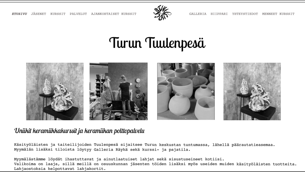
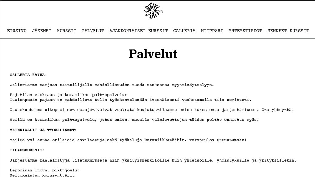
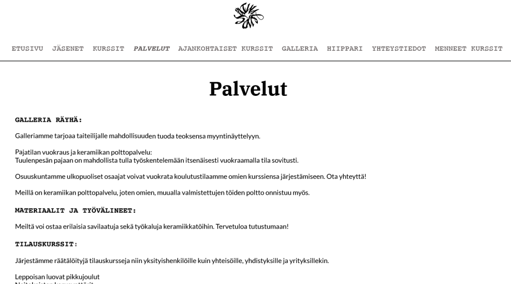
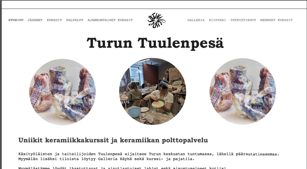
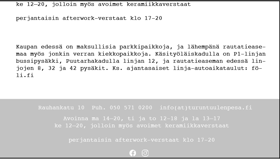
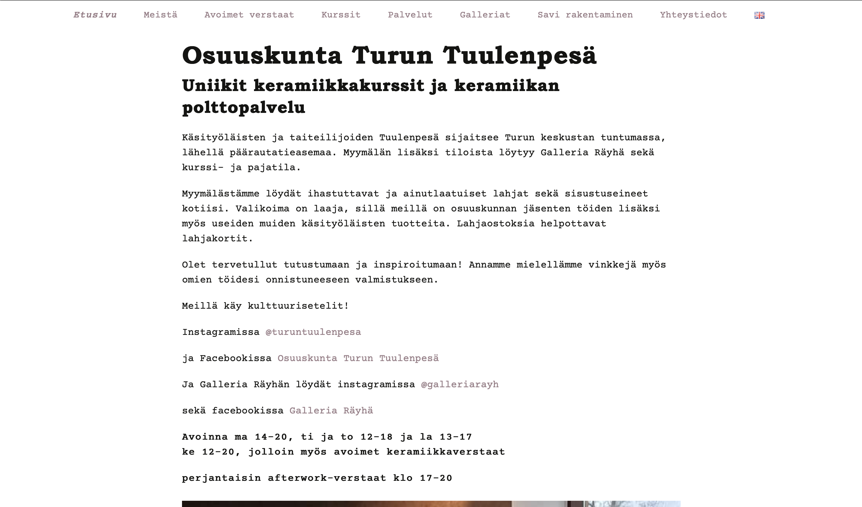
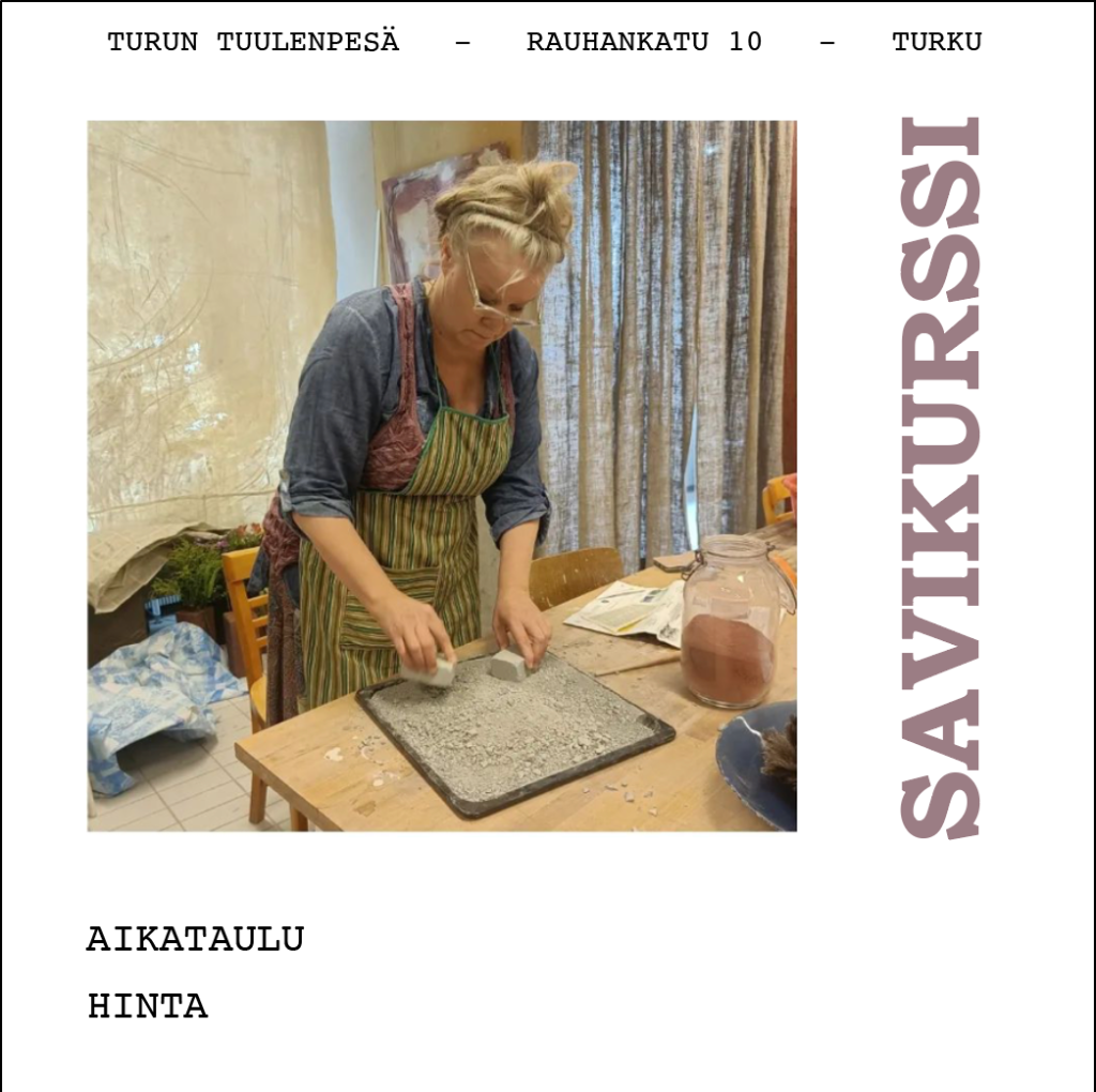
Turun Tuulenpesä co-operative on savipaja, located in Turku, Rauhankatu 10. They offer multiple different types of services related to clay work. For example courses, work shops, rented window space for artists’ own art exhibitions and firing. They also work along side many artists.
Tasks
For my last school on the job learning, I decided to challenge myself by taking on the task of doing website design along side adverts. Turun tuulenpesä had for some time wanted to refresh their website since it was last changed in 2014. They had attempted to have it change a few times but had yet to do so. With my teacher and the store we planned that what my learning period included would be redoing their website, making a base for their instagram ads, creating a new website for their galleries in a similar style and teaching them how to update both websites easily in the future.
If time was left I would help with a few more things. Biggest focus was on completing things.
Planning/schedule
I started scheduling by dividing things by importance and how much each needs. My schedule didn’t work as planned at times because you can’t always predict how busy people will be.
Firstly I planned on having in the first three weeks the website design and outlook done on my part. Which I managed. Then I had a week for wix sites planning as they would be pretty much the same. I ended up making my ad base and business card before the website as I needed to have a more in-depth conversation pertaining to it. I then planned and scheduled a date for when my teaching would take place, told them what is needed for that day and spent the week collecting all info they need to be given to them so they can do said things on their own. Rest of the time was for finishing this blog and things I was unable to do prior.
Main website
Firstly I started by talking with the customer about main changes they wanted change. And what theme they where going for. Here on out this will be a bit messy since there multiple changes, ideas, issues and things I wasn’t smart enough for.
Above you can see my used ad, website and font Pinterest board. I collected things that where heavily base on a new but fitted vibe for their website.
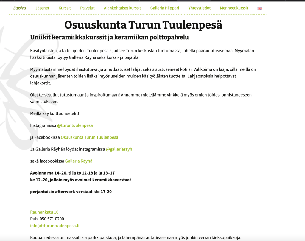
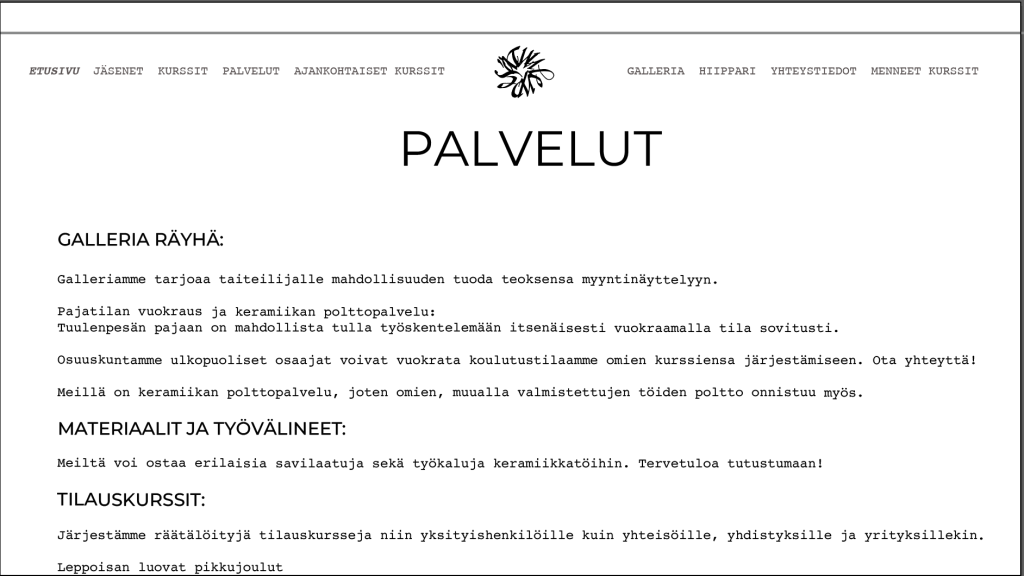
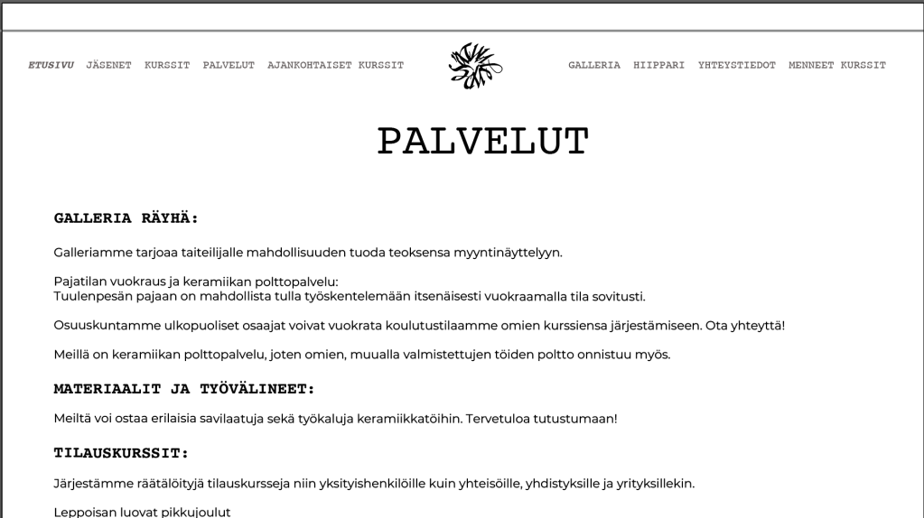
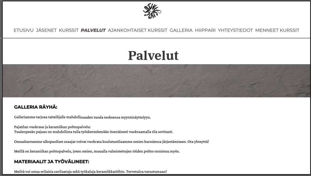
Changes they most wanted was the logo from the background away, more focus on having photos first, colour and font change. Example of the previous website above.


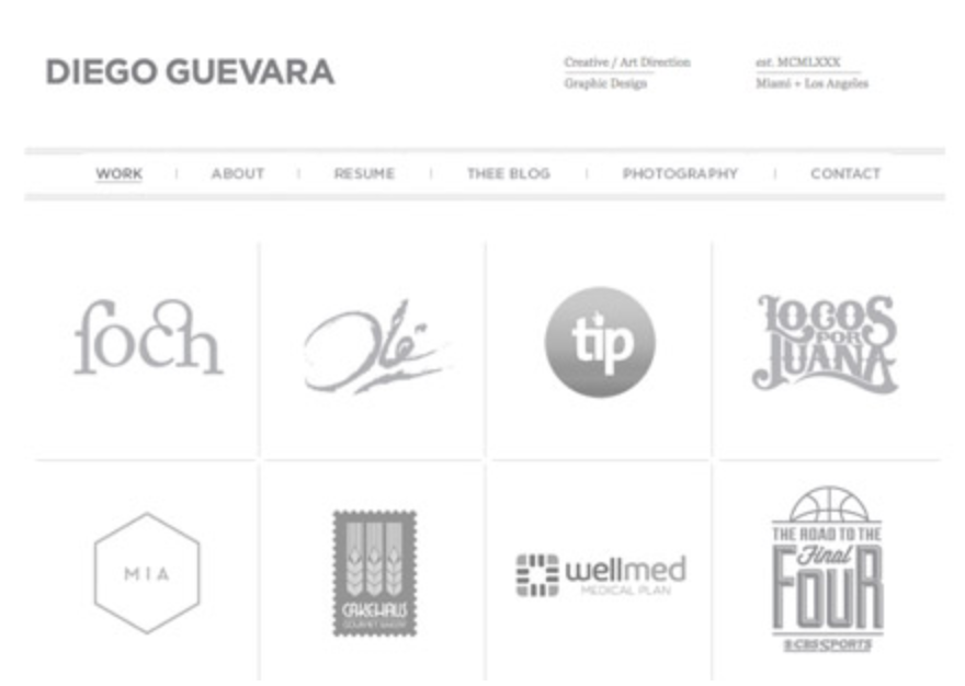
Here are some websites they wanted to use as inspo, as you can see all where very photo focused.
I started everything by first fixing their logo, by turning it a bit on illustrator, and then using a circle I moulded it to be more circler. Also making it have a transparent background. On the right is the new changed logo.


Above are my very first attempts where I more focused on colour and photo placement rather than focusing on fonts. They preferred having multiple photos and not too much colour (like full background).
They were said at the time liked a blues greenish colour and something grey. So I looked up multiple different scales. They did like one of the colours that being the one


In out first discussion, they informed on the fact that currently they really like courier font for text but I could still suggest others. They also liked the used fonts in the logo for their galleria which was courier and another font which they didn’t know anymore. Firstly thought it was the Bozeman font
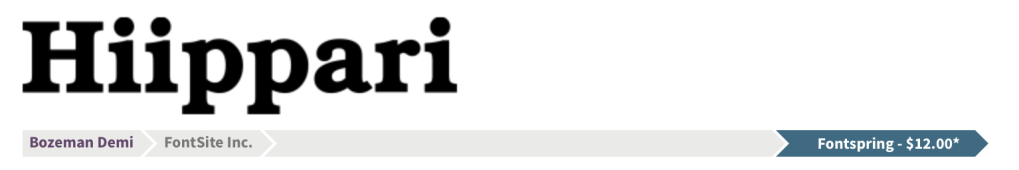
but eventually came to realise it was bookman font in bold. While I did try the two of them together I also tried multiple others.


While some where liked, nothing was really that good, The only thing I got through this was they really liked the courier font. So that
They had a change of their mind and wanted a fully grey scale website. Below examples. They wanted to do this so it would be related to their wall in the workshop.


So I tried a few examples on how it would look like with the things they wanted


They ended up preferring having coloured photos and grey accent colour.


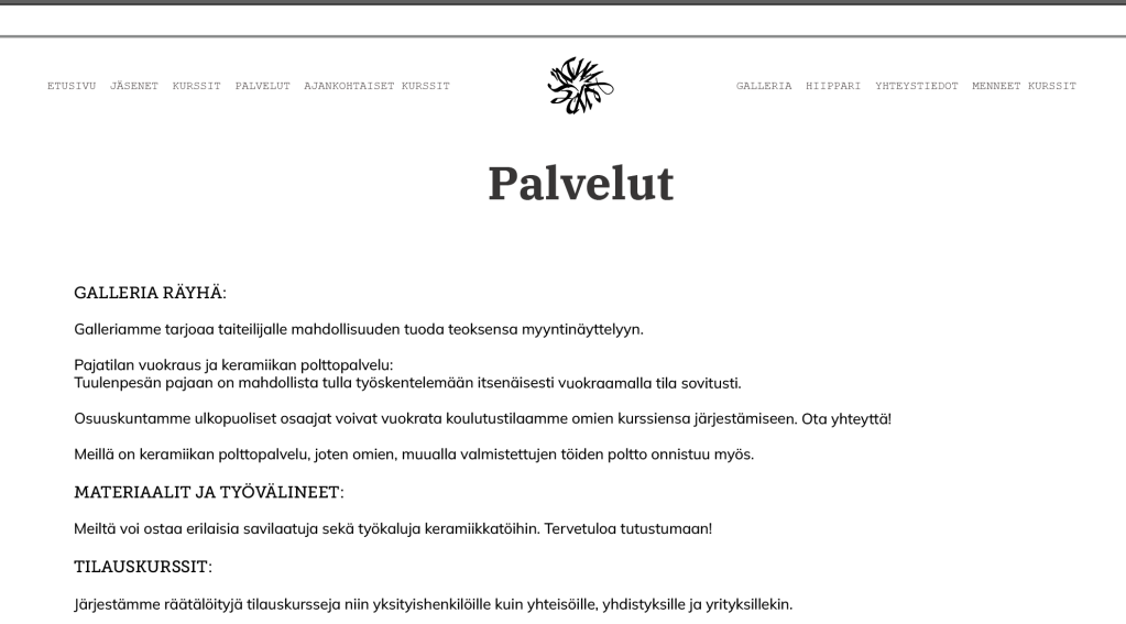


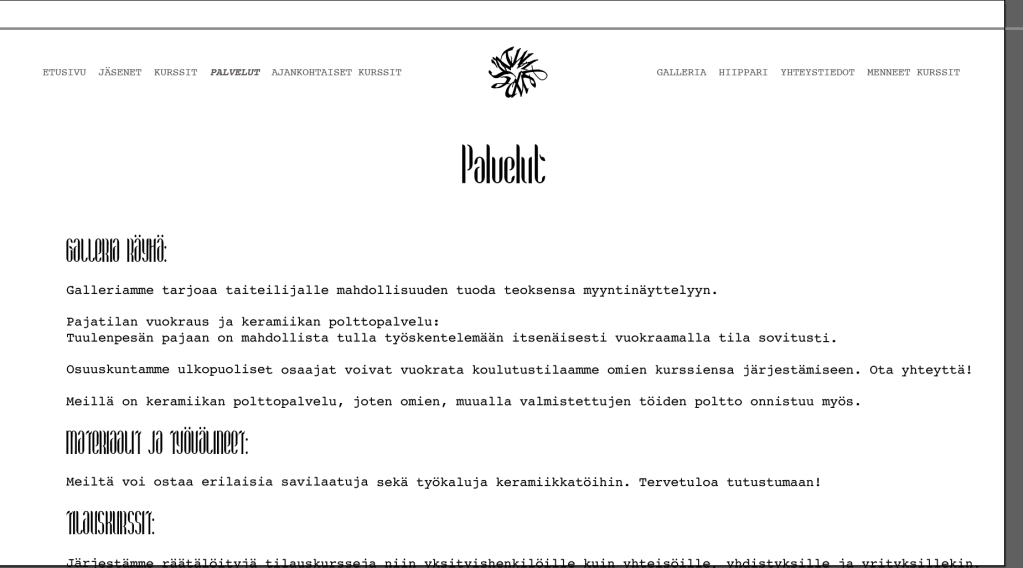
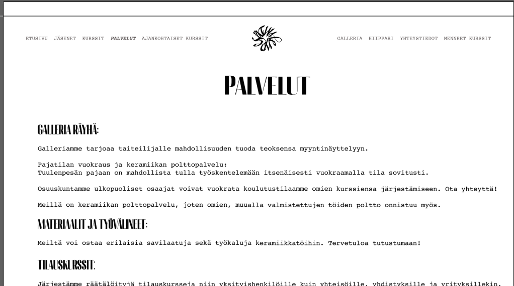


I played around with more different font matches and which font would correlate to which place. I also tried a few more fonts. At this point I had found the for mentioned bookman font. They most preferred having courier font as text and menu font and bookman as titles.


I played a bit more on photo shapes, amounts, logo placements and where colour could be.
With them forgoing the grey scale I ended up trying all different colours, just to play around to find something that would look nice with grey. Also trying to find the perfect grey for them.
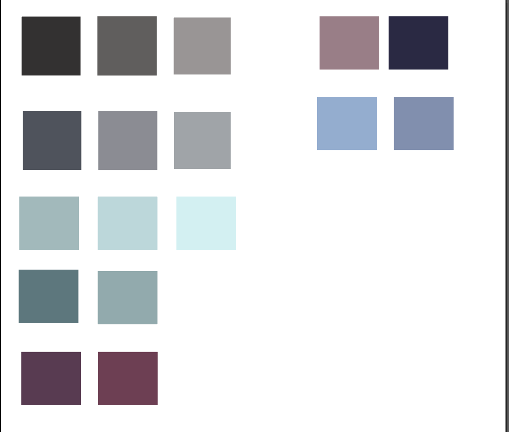


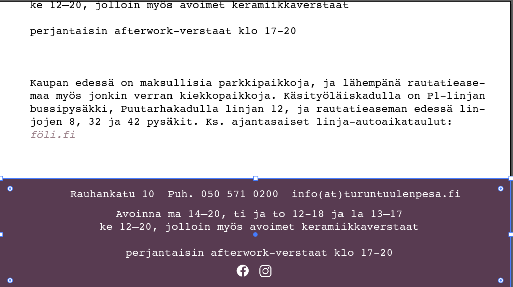


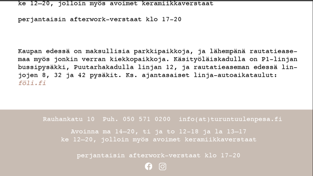
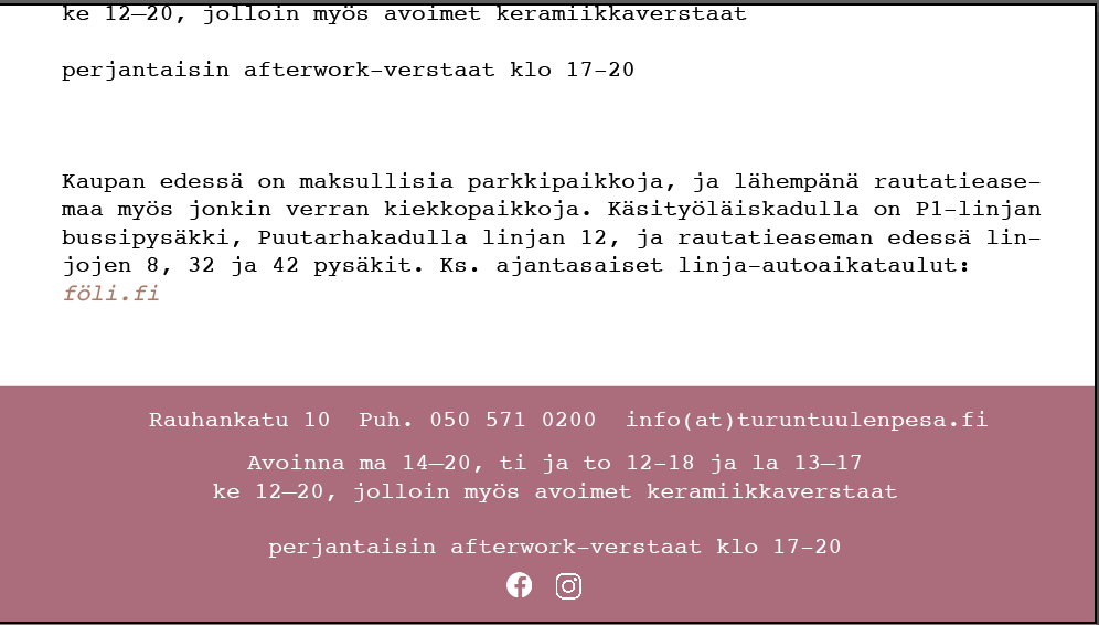


I displayed the colour through attempting them on the footer which I really wanted to add to the page. They ended up finding a nice grey and kind of accidentally when talking I matched one of the shades with it. And they really liked it as it reminded them of a dip colour
Now that I had all info needed to actually start changing stuff for the website without it looking crazy. I had during this time been learning a bit on how changing stuff works on wordpress.org. I started the hardest process of seeing. if I can actually deliver on any of the for shown examples.
I have no prior experience on coding and org heavily works with plugs and coding. Firstly I found a plug to bring any google font to the website and then a plugin to bring bookman font which isn’t a google font.
Secondly I added Simple Custom CSS which ended up at the end coming in clutch. I decided on just changing the coding on the already made child theme for Twenty Thirteen which the prior person had used. Which ended up being a greater challenge as in the beginning I had not realised it was a child theme meaning it didn’t have all the code needed for the changed wanted.
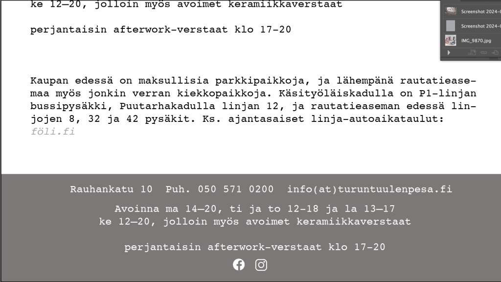
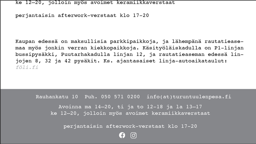
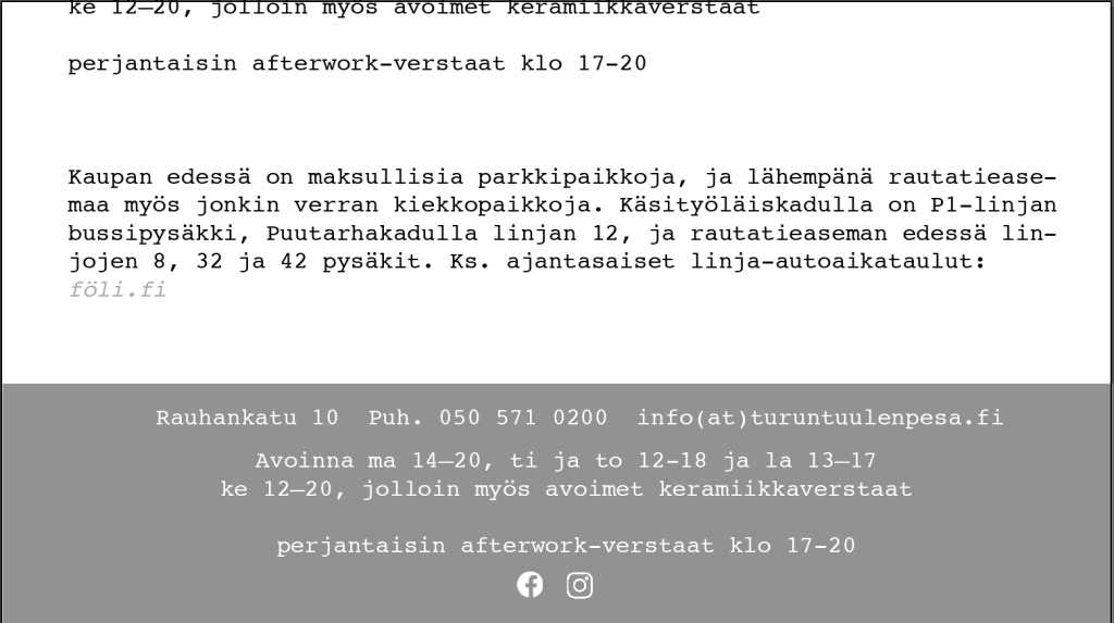
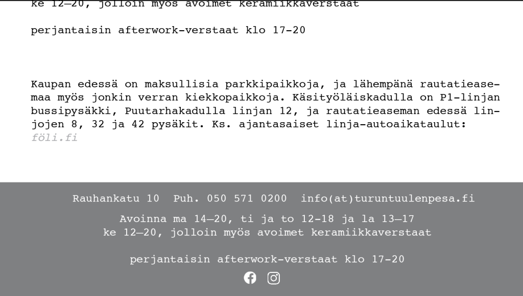
At start I asked for help from my family members as both my dad and brother use coding for their work, my brother ended up being more help as he understood the code much more than my dad. I learned a lot about coding from my brother, Through that I got the colour changed easily and also got the footer added, while I did not end up adding the instagram and Facebook logos with linked as it looked better without them.
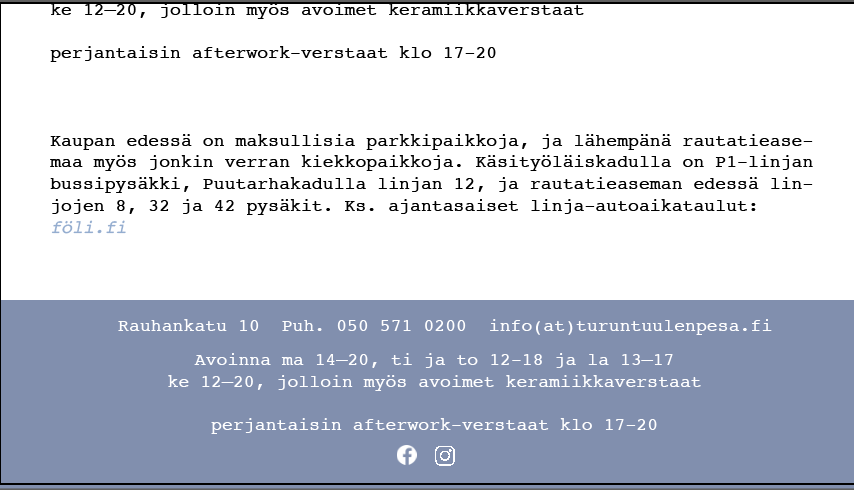
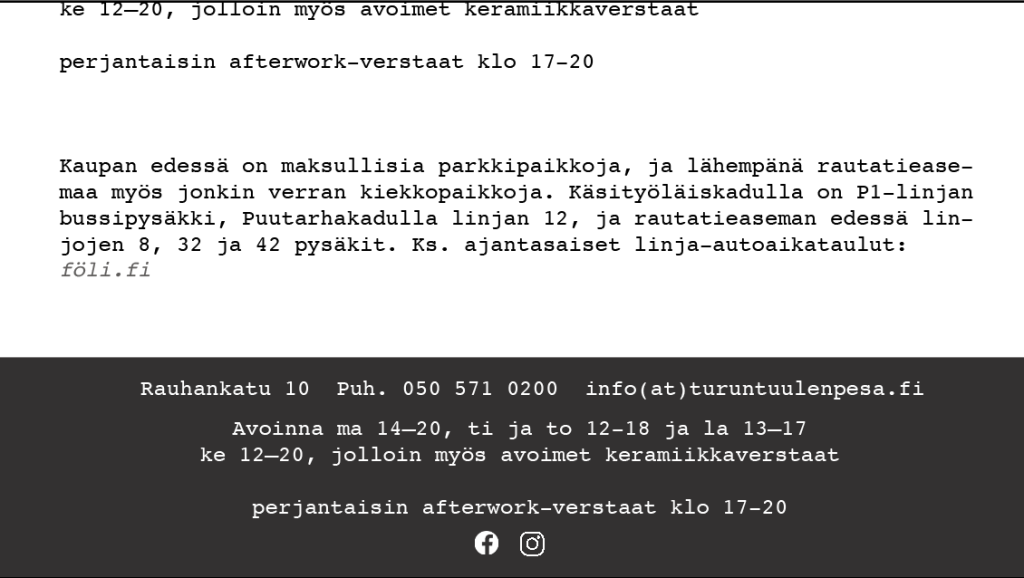
While changing things, i ended up breaking the former child theme they had, and had to use the regular base for it. I had few other mishaps and had to go back and forward multiple times. i ended up getting the top menu bar to stay in place, got the overall look to be nice and clean and change text in a proficient way.

Here below are things that I had time to do. Text and photos changes will be done once they have their texts and photos sorted out.


Spending
For spending I look through bundles and talk to them which options where the best.
The things needed pay for, where was canva pro and wix.
canva 12,99 per month
wix for basics like 16€ month
Galleries website
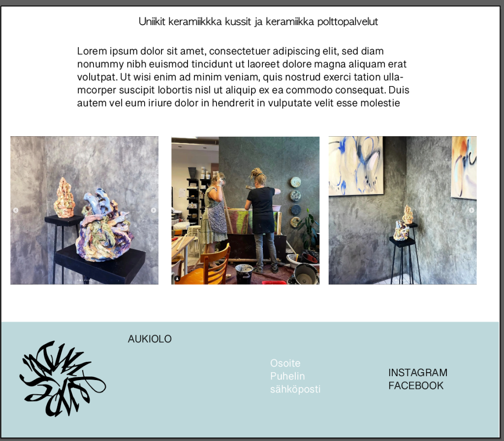
The galleria website was very easy as it would follow the theme of the main website, It was a bit easier to start doing also since wix (the platform they wanted to use) is easier to modify that wordpress, But it is not the easiest for basic changes as coherency. Since it has to be properly edited in all form like tablet, mobile and computer, but I was using a empty starting point and doing it without coding.
I started out with playing around with the logo and with was most needed. Then I laid out more clearly the things and showed to them how it would be better to include all logos since in the future there will be a third one.


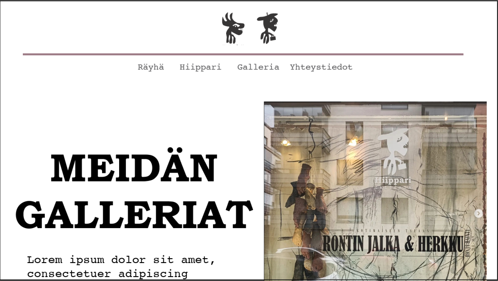
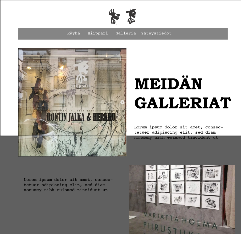

Understanding wix, wasn’t that hard. But I personally feeling like is was pretty complicated and messy as to updating, it would work better if setting a code but I wasn’t too keen on doing so. The website layout is simple and similair to what it is the main website. It looks currently quite empty as I didn’t have any text or photos to add because of the timing. Later own they will add a third logo and text that will be for titles on the center, subtitles and text on the side (position will be around 10% off the side)


Instagram ads &
business card
My Inspiration for instagram ad for to make it a bit more coherent to the theme and tiny bit more simplistic without as much text. So it would be more of an ad.
Below are two of my inspiration and a example of their previews ads.


After looking into what you can do in canvas and finding out you can insert your own fonts, I then started by doing a few simple test in illustrator. After that I asked for comment from the ladies and they both liked them but wanted them to have more alignments. After my fixes all was ready for me to create four repeatable bases once they had bought canvas pro.


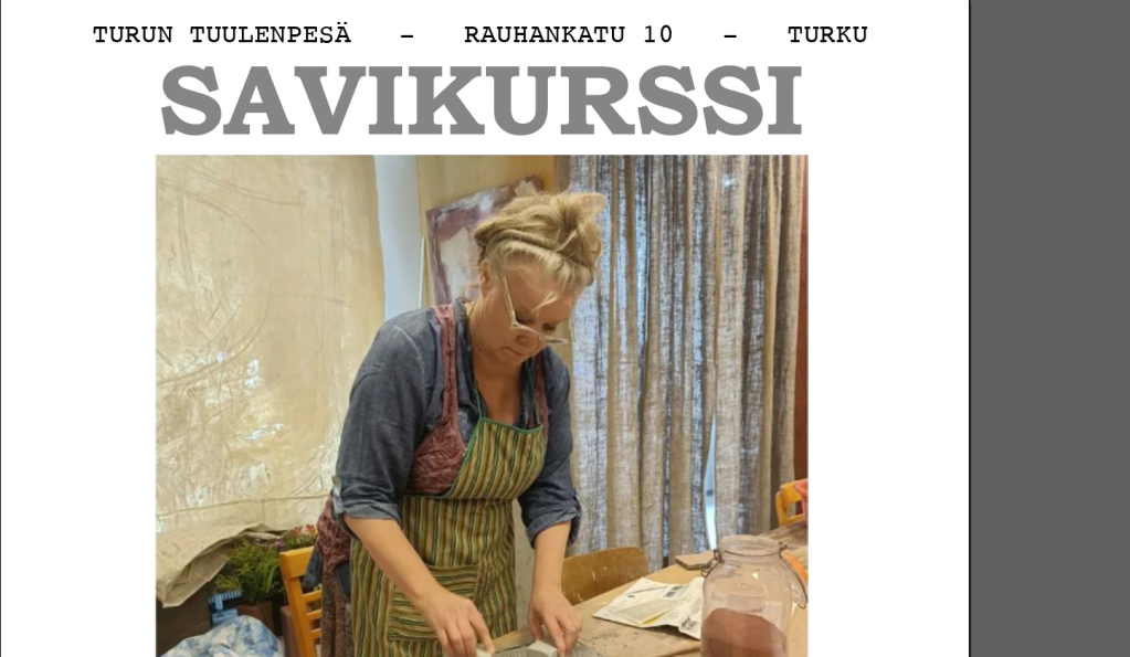


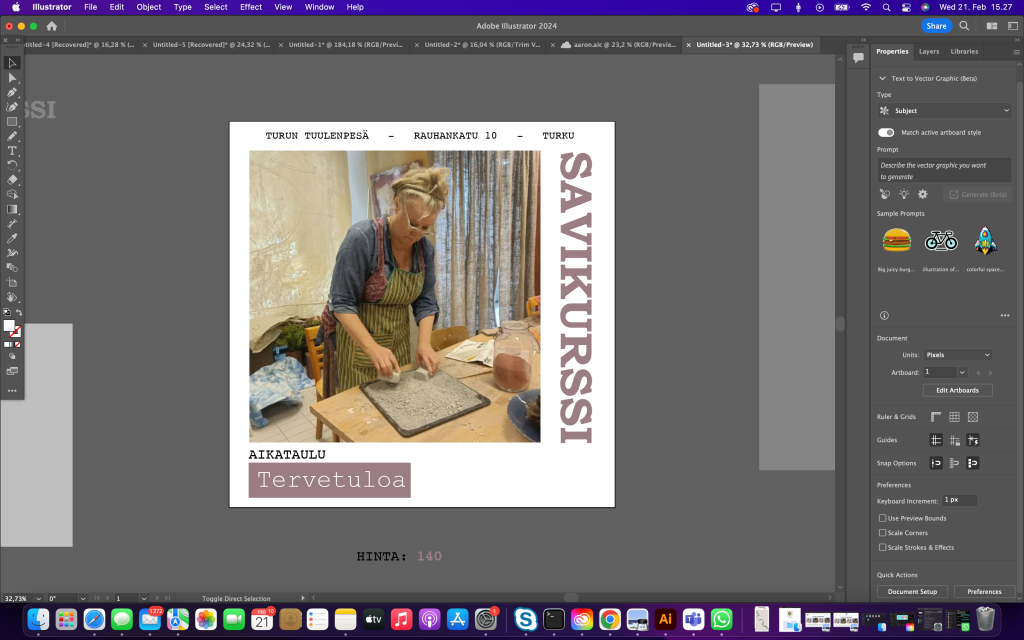


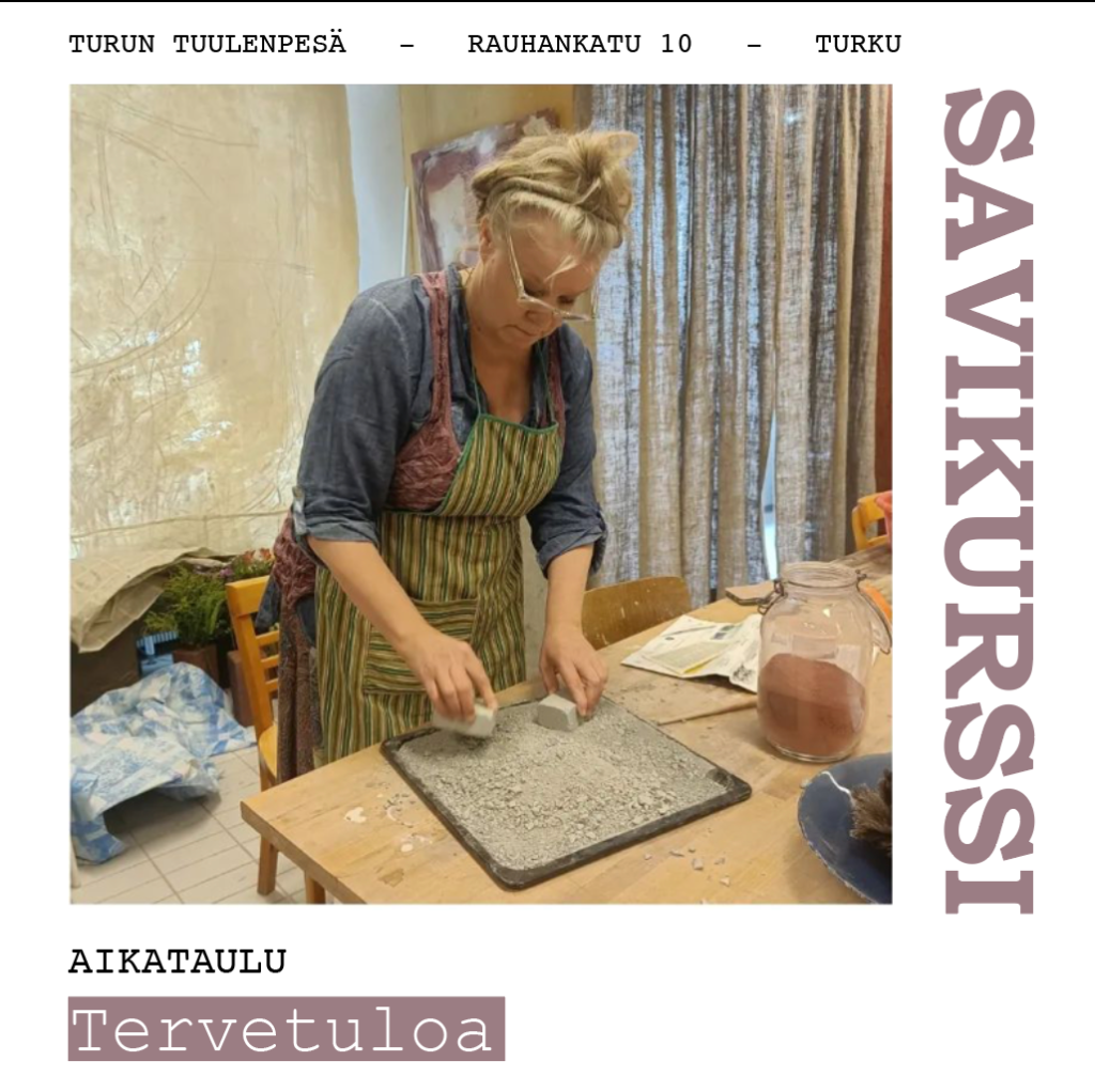


Here are those bases, They have yet to upload the font needed so I used a similair one to display, how it would look like


Käyntikortti
Below is a photo of their past business card, It had a bit too much text and was too big of a size.
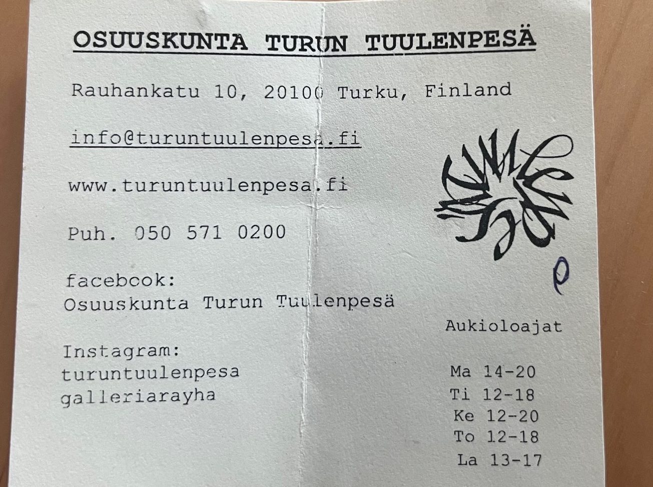
I wanted it to have not only the correct fonts, changed logo but a over all a more clean look. I did want to give options of keepin the opening hours, while I prefer it to just have the location, e-mail, website and phone number. As those are the most important information to keep. I removed the instagram and facebook as they aren’t this stores main interested and use up too much space. I kept it so that it can be easily printable without color anything too fancy.

Brand Image
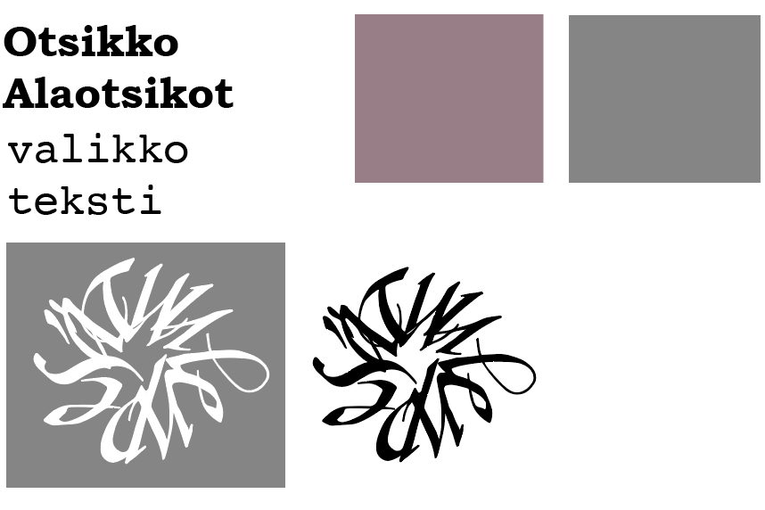
the colour codes are #997e87 and #858585
I tweaked their logo to be more like it was originally, meaning more circler and so that when looking you would see the start first rather than u.
Fonts used are Bookman bold for titles and courier for the rest.
